Drawing Poppy Flowers with Colored Pencils Step by Step
Updated: September 28, 2026
12
Soft petals and vibrant colors make poppy flowers a beautiful choice for colored pencil artwork. This step-by-step tutorial shows you how to create a realistic poppy drawing using simple techniques and careful layering. You will learn how to shape delicate petals, blend natural shades and add fine details that bring the flower to life. Each step helps beginners understand coloring methods while improving their confidence and artistic skills. Create your poppy flower drawing with easy colored pencil techniques and simple steps.
Table of Contents
5 Step Process for Drawing Poppy Flowers with Color Pencils
Explore simple coloring methods to enhance your pencil skills and create beautiful poppy flowers that show your creativity and passion for art.
Step 1: Draw the Line Sketch Using a Graphite Pencil
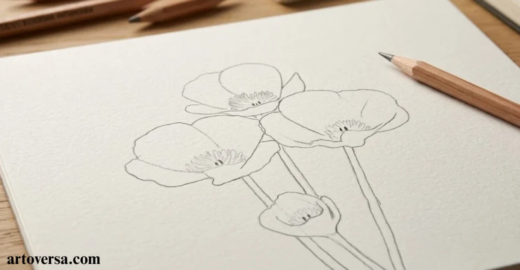
Create a smooth starting point for your poppy artwork by building a light sketch that supports every coloring stage.
- Begin with a soft graphite pencil outline and carefully arrange three fully open poppy flowers with one slightly closed bloom. Keep the stems slender and balanced while focusing on the complete structure before adding detailed petal shapes.
- Carefully build the larger flower forms first because this helps maintain accurate placement and spacing. Avoid adding leaves at this stage so the beautiful blooms remain the main attraction of the composition.
- Gradually refine the petals with natural curves and uneven edges to match the delicate appearance of poppy flowers. Avoid making each petal identical because slight variations create a more realistic botanical look.
- Maintain gentle pencil pressure throughout the sketching process because dark graphite can show beneath lighter colored pencil layers. Light marks allow easier adjustments and provide more flexibility during future coloring steps.
- Focus on creating a simple and clean guide rather than completing every tiny detail immediately. A well-planned sketch makes the later stages easier and helps the final artwork appear more balanced.
Common Problems and How to Overcome Them
Many beginners create heavy graphite lines while preparing their flower sketch, which can affect the softness of the final colors. Keep the outline light and avoid overworking early details. Building simple shapes first creates a cleaner base for coloring.
When I first practiced drawing poppies, I rushed into petal details before checking the overall arrangement. After improving my sketching method with lighter guidelines, my flower compositions became smoother and more controlled. This technique helped me achieve a softer and more realistic finish.
Step 2: Basic Light Coloring – First Layer
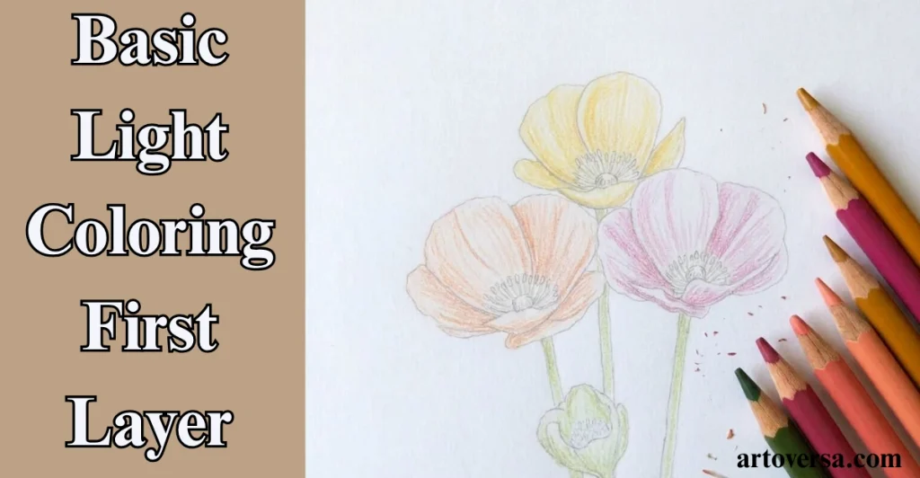
Start adding gentle colors to your poppy flowers by creating a soft base that prepares the artwork for deeper shades.
- Apply the first colored pencil layer with light pressure and cover each petal using smooth strokes. Choose soft orange, yellow and pink shades while keeping the colors gentle enough for future layering.
- Select a pale yellow tone for the closed bud to create a small difference from the open flowers. This variation helps the arrangement look more natural while keeping all blooms connected within the composition.
- Build the colors slowly instead of filling the petals with strong shades immediately. Light applications protect the paper texture and allow additional layers to blend smoothly without creating a rough surface.
- Add a soft green foundation to the stems while maintaining the same gentle approach used for the petals. This early layer creates support for adding shadows and richer tones later.
- Remember that the first coloring stage is only the beginning of the process. A soft base gives you more control when developing depth contrast and realistic details in the next layers.
Common Problems and How to Overcome Them
Many beginners apply too much pressure during the first coloring layer, which makes blending difficult later. Use light strokes and build colors gradually instead of trying to achieve full intensity immediately. Patience creates smoother and more natural results.
At the start of my colored pencil journey I often added strong colors too quickly and struggled with smooth transitions. After learning to create gentle first layers, my flower drawings became more vibrant and realistic. This method improved my overall coloring control.
Step 3: Erase the Graphite Outline
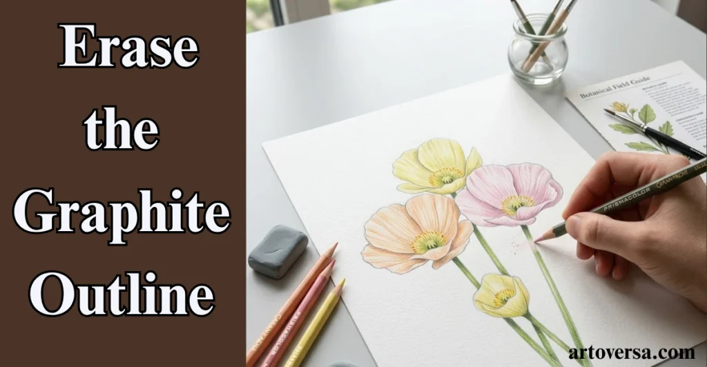
Refine your poppy drawing by removing extra graphite marks and allowing the colors to create a softer natural appearance.
- Gently remove the remaining graphite outline after the first color layer has covered the main flower shapes. Erasing unnecessary marks helps the petals look softer and more blended.
- Choose a kneaded eraser because it carefully lifts graphite without damaging the paper or disturbing too much colored pencil. Work slowly around detailed areas to maintain the smooth appearance of the flowers.
- Notice how removing dark lines allows the colors to define each petal naturally. The artwork starts appearing lighter because the focus shifts from outlines to gentle color transitions.
- Avoid worrying if small areas of color fade during this process. Additional colored pencil layers can easily restore those spots while creating more depth and richness in the final result.
- Continue refining the surface after cleaning the sketch marks and prepare the drawing for further shading. A cleaner base helps future details appear clearer and more professional.
Common Problems and How to Overcome Them
Some artists erase too strongly which can remove too much color from the flower surface. Use gentle movements and focus only on unwanted graphite marks. Careful cleanup keeps the artwork smooth and ready for more layers.
I first used this technique, I was worried that erasing would damage my colored pencil work. After practicing gentle cleanup, I noticed my flowers looked much softer and cleaner. This step became an important part of creating polished botanical drawings.
Step 4: Coloring the Shadows with Complementary Colors
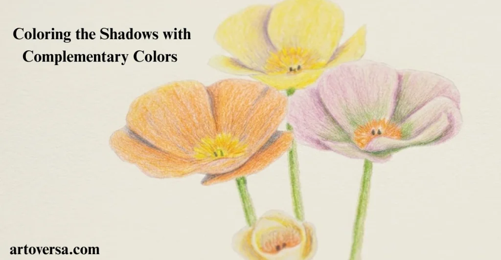
Bring your poppy flowers closer to realism by adding gentle shadow tones that create depth and natural contrast.
- Introducing complementary colors into the petal folds helps create richer shadows without losing the original beauty of the flowers. Use soft blue touches on orange areas and other opposite shades to build natural depth.
- Blending violet tones into yellow petals and subtle green shades into pink flowers creates smoother shadow transitions. These added colors should remain gentle so the petals keep their fresh and delicate appearance.
- Creating darker areas where petals meet allows the flowers to look more three-dimensional. Overlapping sections naturally receive less light, so careful shading improves the realistic structure of each bloom.
- The shadow areas with light layers make the poppies appear more vibrant and balanced. Avoid strong applications because soft changes in value create a more natural effect.
- Maintaining a steady hand while adding complementary shades helps preserve the softness of the petals. Slow layering gives better control and allows the colors to blend beautifully together.
Common Problems and How to Overcome Them
Many beginners add too much opposite color, which can make the petals lose their natural appearance. Apply small amounts and blend carefully with the base shades. Balanced shadows create a softer and more realistic flower drawing.
At the start of my colored pencil practice, using complementary shades felt difficult because the colors often became too strong. With regular practice, I learned to apply them gently for better depth. This method helped my floral artwork look more natural and refined.
Step 5: Deepen the Colors by Shading Another Layer
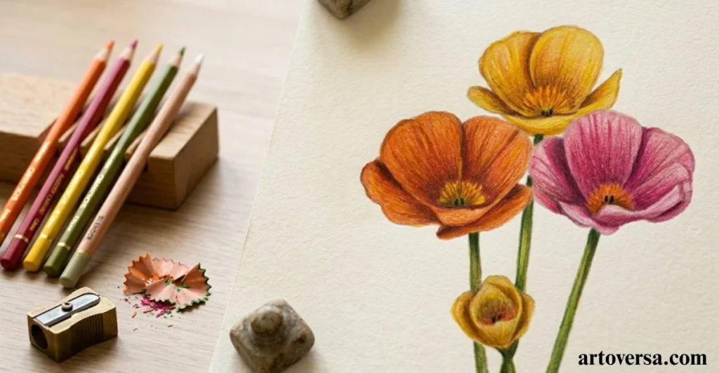
Strengthen your poppy artwork by building extra color layers that add richness and a smooth, realistic finish.
- Adding another layer of the original colors helps increase the vibrancy of the petals while keeping the earlier shadows visible. Gentle orange yellow, and pink tones can create a stronger floral appearance.
- Building the shades slowly with repeated light strokes produces smoother results than applying heavy pressure. This technique keeps the paper texture intact and allows the colors to blend naturally.
- Improving the stems with darker green values on one side creates a rounded effect. Small adjustments in tone help the stems appear more realistic and connected with the flowers.
- Refining each bloom after layering allows you to correct uneven areas and strengthen weak shadows. Careful observation makes the final drawing look more balanced and detailed.
- Finishing the stage with small improvements across the artwork gives the poppies a soft luminous quality. A few final touches can enhance depth while keeping the delicate character of the flowers.
Common Problems and How to Overcome Them
Some artists rush the final shading stage and add heavy layers that make the artwork look rough. Increase color gradually and focus on smooth blending. Slow progress creates a cleaner and more professional result.
I used to add darker shades quickly to complete the artwork faster. Over time, I learned that patient layering creates better results. This approach now helps me achieve soft colors with realistic depth.
Conclusion
Drawing poppy flowers with colored pencils is a relaxing way to explore colors and improve your artistic skills. This step-by-step process shows how simple layers, careful shading, and soft blending can create a beautiful floral artwork. With regular practice, you will become more comfortable with creating realistic petals and natural details. Every drawing gives you a chance to learn new techniques and improve your confidence. Take your time, enjoy each stage, and allow your creativity to guide your work. The more you practice, the more your colored pencil drawings will develop a realistic and graceful look. Keep exploring new subjects and continue growing as an artist.
FAQs
What Colors Work Best for Drawing Realistic Poppy Flowers?
Begin with soft orange, yellow, and pink shades to create a gentle base. Add darker colors slowly as you build each layer. This approach keeps the petals looking bright, smooth, and natural.
Why Should You Keep the Graphite Sketch Light?
Light sketch lines are easier to cover with colored pencils and erase if needed. They also prevent dark marks from showing through the final colors. A soft outline gives your drawing a cleaner finish.
How Can You Make Poppy Petals Look More Realistic?
Draw each petal with slight differences in shape and edge to avoid a stiff look. Add gentle shadows where the petals overlap. These small details make the flower appear more lifelike.
When Should You Erase the Graphite Outline?
Erase the graphite after adding the first light layer of color to the drawing. This removes visible sketch lines without affecting the overall shape. A kneaded eraser works best because it lifts graphite gently.
Why Should You Use Complementary Colors for Shading?
Complementary colors help create soft shadows while keeping the petals bright and fresh. Apply them lightly and blend them with the main colors. This adds depth and gives the flower a more realistic appearance.
How Can You Blend Colored Pencils Smoothly?
Use light pressure and build the colors with several thin layers instead of one heavy layer. Blend each layer carefully to avoid rough patches. Taking your time creates a soft and professional-looking result.
Please Write Your Comments